case studies


My Favorite Murder with Karen Kilgariff & Georgia Hardstark: Shirt Design

"I Feel Like Drawing Tonight"

I said to myself late at night in February 2020. I just wanted to practice some hand lettering, really. I posted it on Instagram and went to bed. The next morning, my phone had blown up with notifications - turns out the official My Favorite Murder Instagram page shared my art!

Howdy-Ho, Murderinos!

With my new popularity, I thought it might be a good idea to draw some more podcast art, drawing what I’d want as a poster. As soon as it was posted, the official MFM Instagram shared my art again, and I had a direct message from them, asking for my email to put me in contact with their merch guy, Denton. I replied embarrassingly fast to their DM with my email and waited. After a few days, Denton, asked to see all my artwork I had done for the podcast. They requested some edits, but in the end it fell through. I put it behind me until later, someone sent me a link to bootleg shirts with my design on it - and this wasn’t the first time this design was stolen. Annoyed, I decided “you know, what’s the worst that can happen” and I emailed Denton, explaining the situation to him.

"We Are SO Excited To Launch Our New Merch"

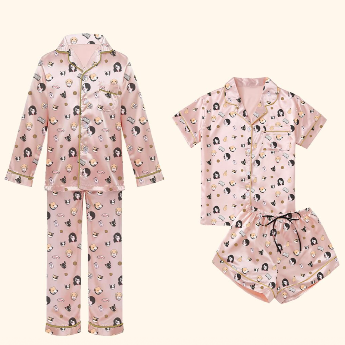
To my surprise - he told me the good news that actually, yeah! Karen & Georgia did want it as official merch! In October 2020, my shirt design went live on their shop and I bought one immediately. Good thing, too - my friend informed me a couple days later she wanted to buy one, but they were all sold out.


Catastic Cat Cards - Capstone


Why Cards?

I’ve always wanted to make a deck of cards, but could never find the time. So, when the Spring 2021 semester came and it was time for me to do my Illustration Capstone project, I had no hesitation in what I was going to do. Cards. And cats. Cat cards. Cat-stone.

So Why Cats?

Why not cats? Cats because I like drawing cats, it’s really as simple as that.

Process

Step 1: Sketches. So many sketches of so many cats. Lots of color brainstorming too - black & white and red like a traditional deck? Complimentary colors? Purple and pink? After initial critiques, I decided to…
Step 2: Revisions. The consensus was that they were adorable and people were super into them. I made edits to the positions and layout of the cats, and decided that I wanted to do pastel colors and black and white. After that, it was time to…
Step 3: Initial Printing. Send them off to the printer and see what happens! This stage was really fun. I loved holding my cards, and putting together the box was satisfying. Everything looks good, aside from some minor edits to make in regards to the box text layout.
Step 4: As of April 2021, this is where I’m at now! I’ve researched where to mass print these at a higher quality than my prototype deck, and now I need to gauge interest, take preorders, and release my Catastic Cards out into the wild.


Dirigo Collective Internship:
Fall 2020-Spring 2021

Dirigo Collective is an independent media company in Maine that specializes in channel strategy and audience engagement. Super fun people, they were really welcomed me with open arms! In my time as a Content Intern at Dirigo, I made lots of Instagram carousels, did research on the benefits of using Pinterest, TikTok, and Instagram and which platform is best for what. I also did some character design for their podcast, Booger Talk. In the slideshow are some highlights of my work.


KIRUNIVERSE Internship:
Summer 2020

KIRUNIVERSE is a radically collaborative experience marketing and design firm based in New York City, empowering artists and entrepreneurs with purpose-driven brand strategy, creative writing, graphic design, social media planning, and web design. My time as a Design Lead Intern was such a blast - KIRU himself is an amazing human being, and being trusted to be in a leadership role among my peers of other interns was very rewarding. At KIRUNIVERSE, I collaborated with KIRU on the 100-something page KIRUNIVERSE Brand Bible, completed 5 Brand Guide X designs, illustrations for clients, and creative briefs for the KIRUNIVERSE collective. The slideshow shows some of the highlights from my summer at KIRUNIVERSE.


Wedding Invitations & Stationery

First Things First

“What’s more intimidating than doing your older sisters wedding invitations?!” was my initial thought going into this. I was comforted that she was helping with the layout, because of course she wanted a trendy invite that folds out and becomes a map.
“One step at a time” I told myself. And the first step was drawing the bride and groom themselves. At first, this was fully colored - but later on we decided to go with just the wedding colors of pink and navy. I referenced their engagement photos and added some cherry blossoms for their DC wedding.

A Lesson In Options

I quickly learned to not ask how many elements of something she wanted because I knew the answer was options. Was everything used? No. But the option was there. So I gave her lots of cherry blossom options. A wreath shape. Trees. Branches. Different branch. Another different branch! The venue, the back of the venue, her condo, the… Tardis? Sure thing, anything for you, sister of mine. The Capitol, the Washington Monument, the hotel where the wedding part was to stay at, a club they like to go to I think? All of it!
Originally, all buildings were filled in with the navy color. My sister wanted the option (I should have known) of seeing just outlines. But also, kind of filled in but mostly outlines. But still some navy. And kind of filled in. We made it work.
The layout of the actual invites was done by her, and was a pamphlet that unfolded to show a map of DC. “For the old people,” she’d say.